Deejay's
Branding & Visual Identity
[PT-BR]
Sobre
Deejay's é uma escola de música situada na Alemanha, onde os alunos aprendem, do básico ao avançado, a tocarem instrumentos musicais diversos. O conceito por trás da escola e também o slogan (Music at all), é a ideia de levar aprendizado e música para todos, de uma forma fácil, leve e democrática.
[EN]
About
Deejay's is a music school located in Germany, where students learn, from basic to advanced, to play different musical instruments. The concept behind the school and also the slogan (Music at all), is the idea of bringing learning and music to everyone, in an easy, light and democratic way.

[PT-BR]
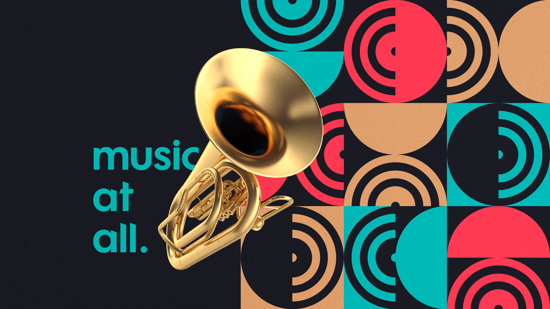
Conceito
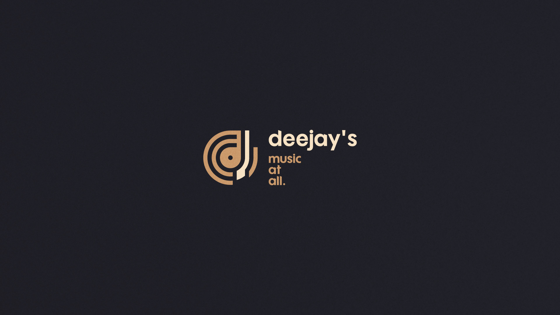
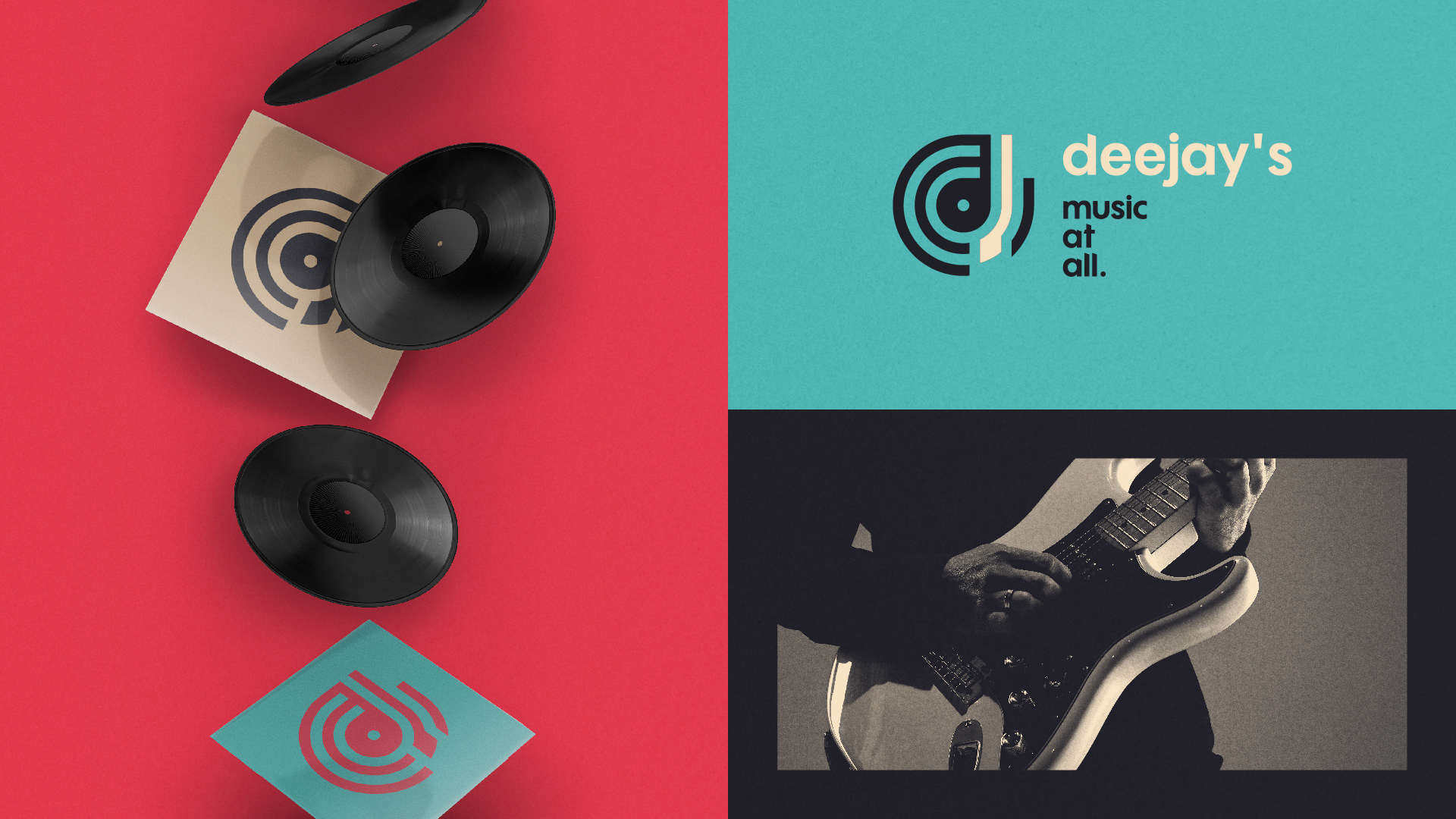
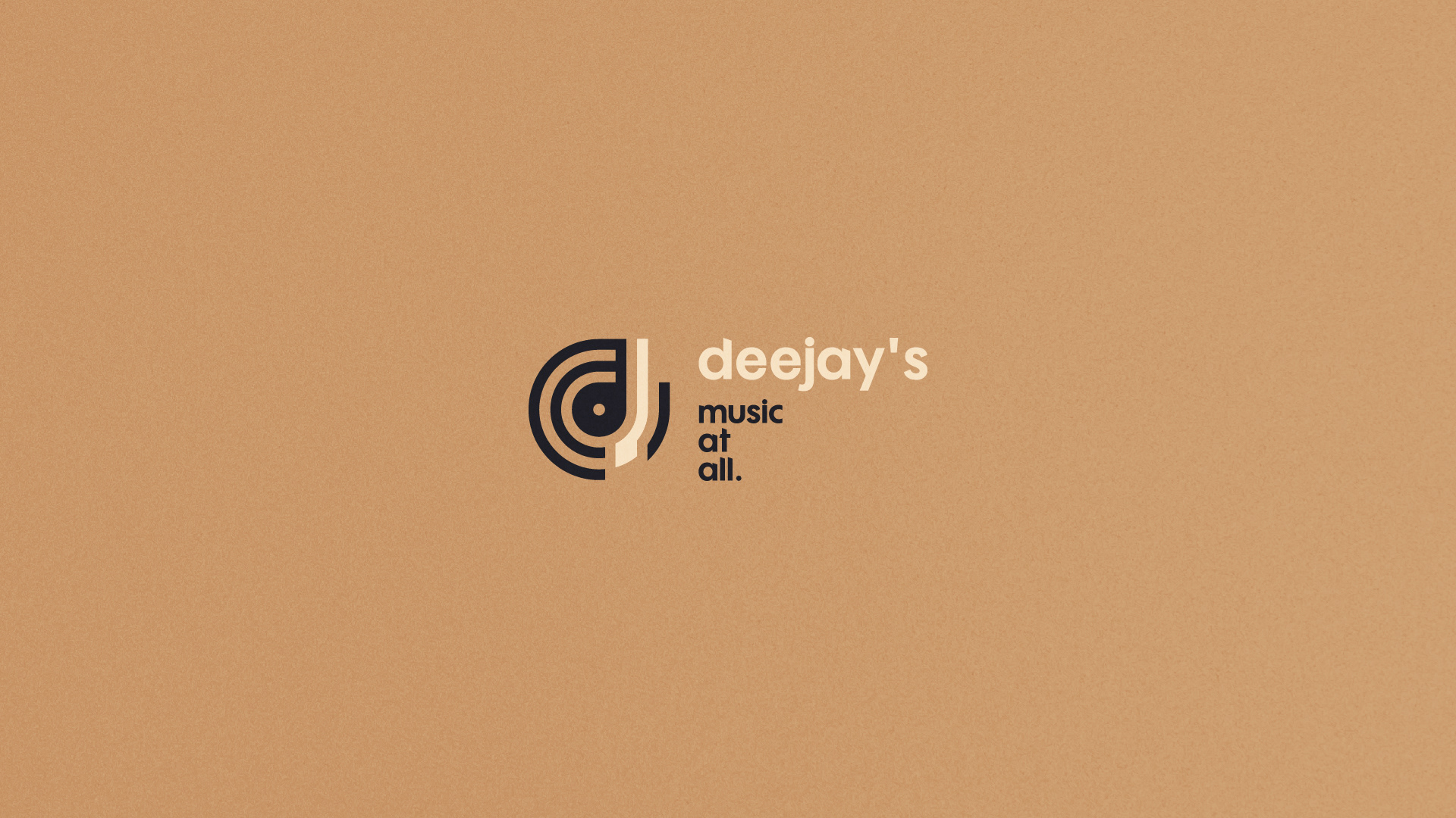
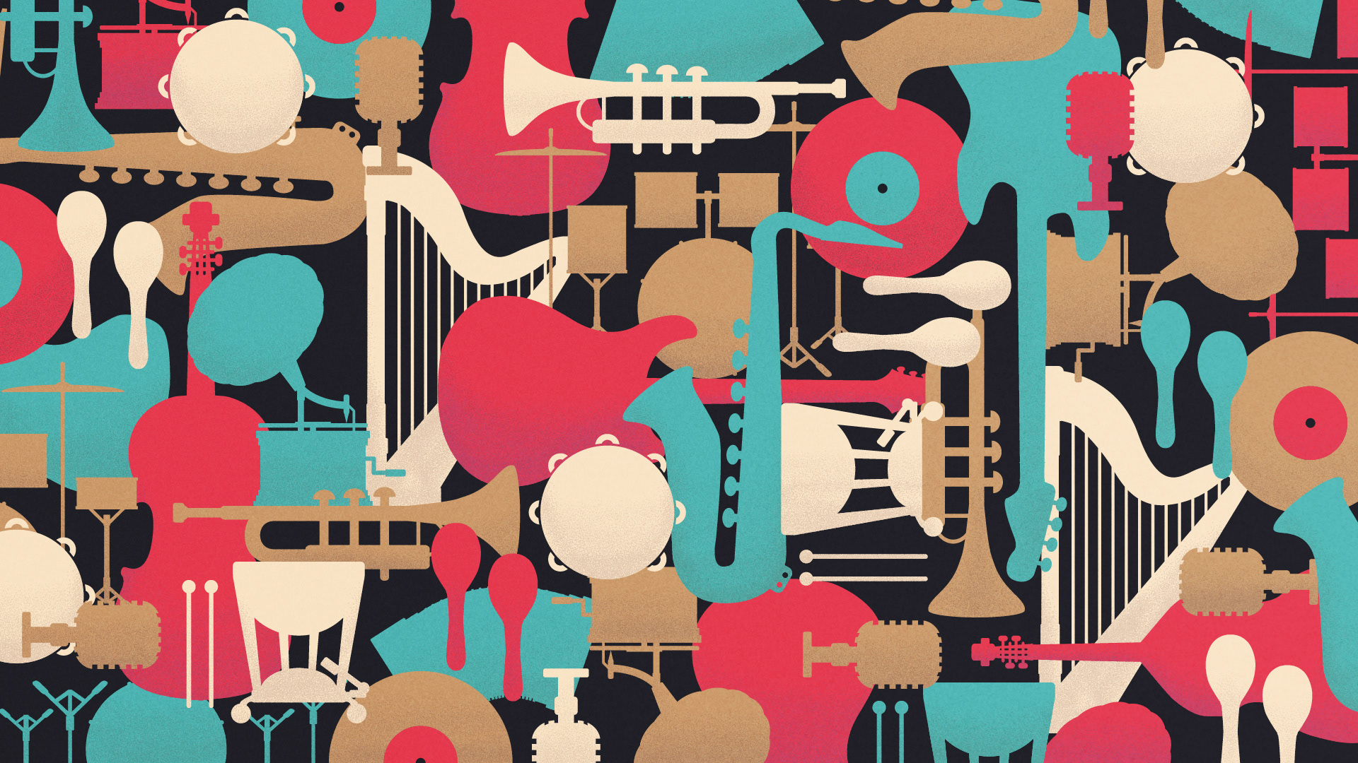
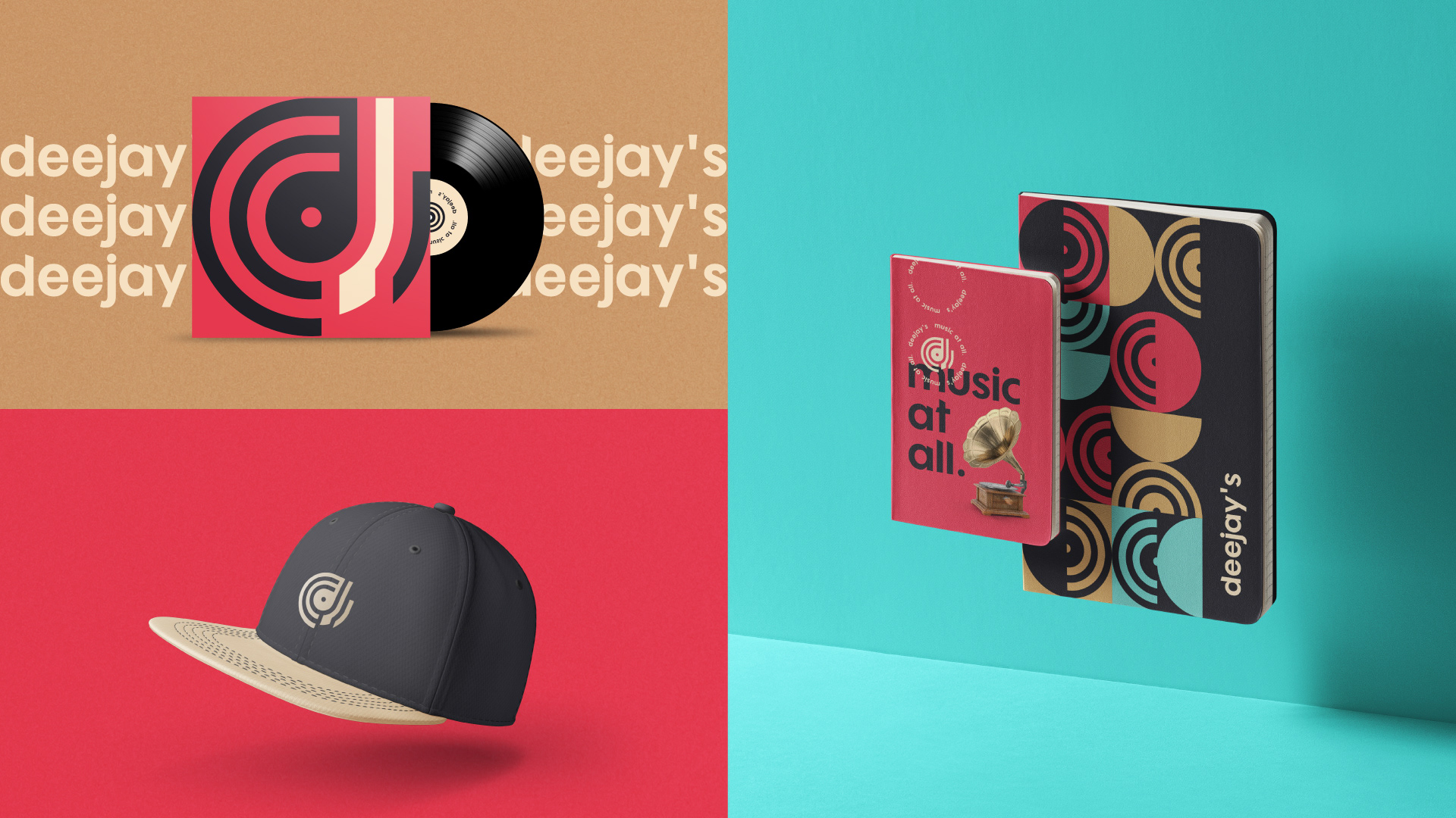
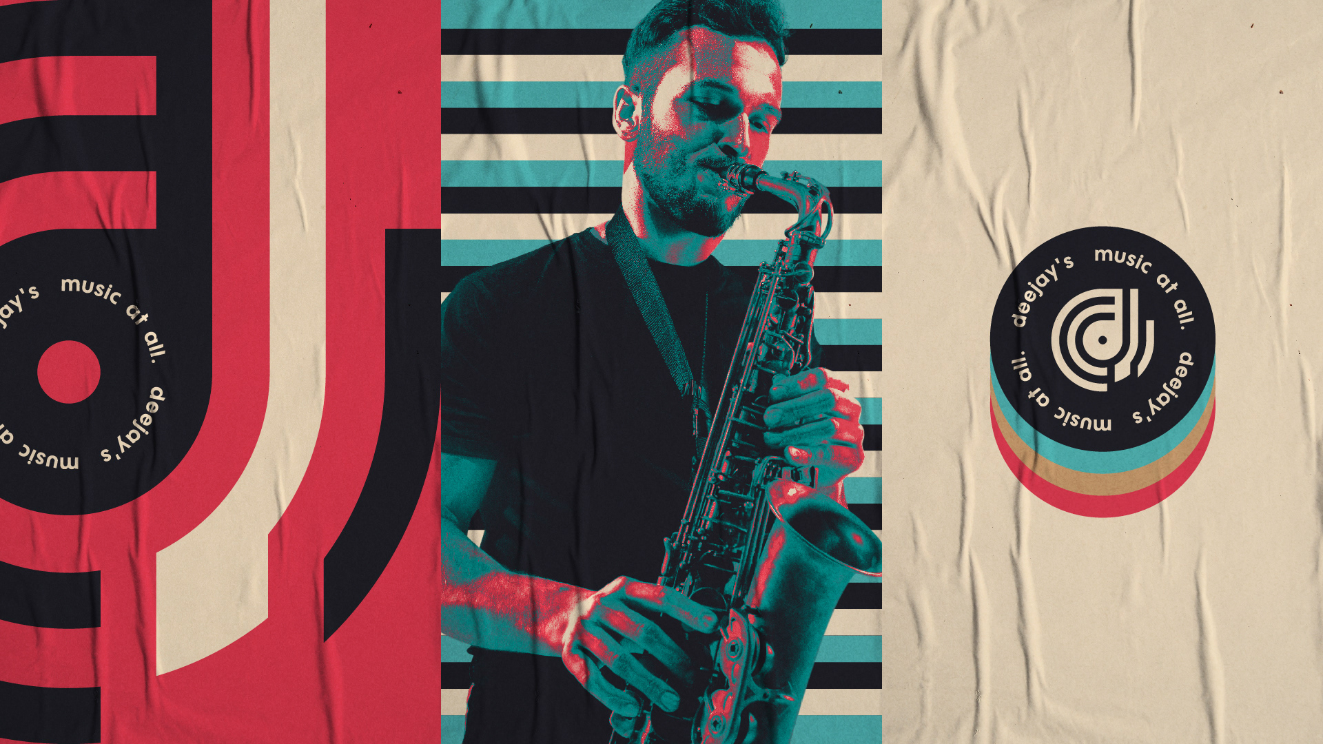
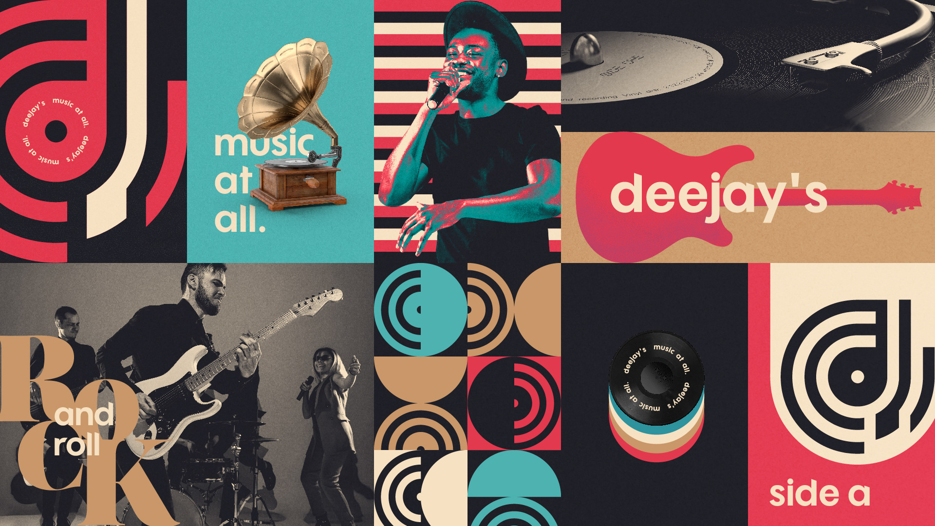
Para representar a marca de forma atemporal, foi desenvolvido um símbolo que incorpora: uma vitrola, ondas sonoras, e as letras D e J. As referências antigas, agregam valor e trazem uma certa bagagem para a instituição de ensino.
[EN]
Concept
To represent the brand in a timeless way, a symbol was developed that incorporates: a record player, sound waves, and the letters D and J. The old references add value and bring a certain baggage to the educational institution.

[PT-BR]
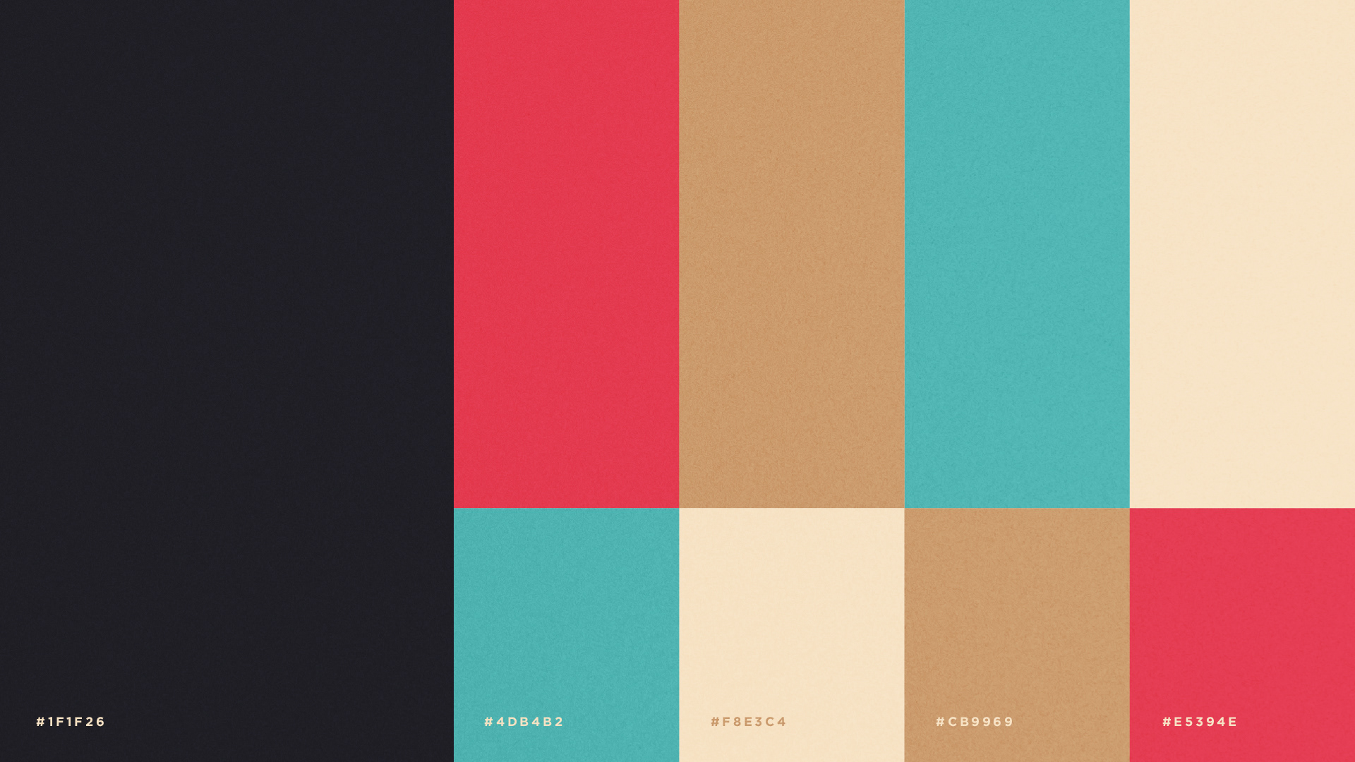
Cores
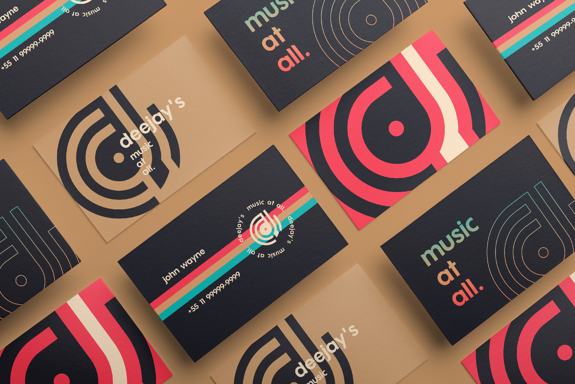
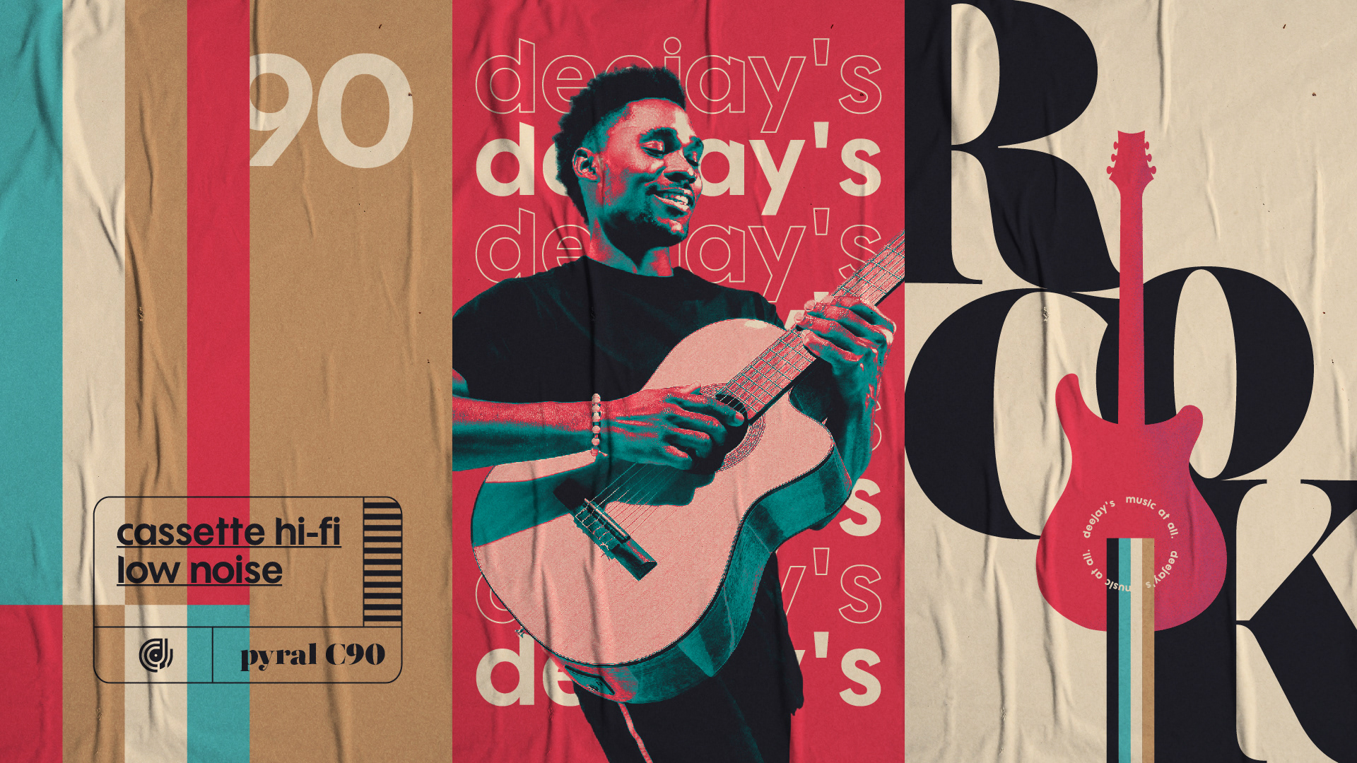
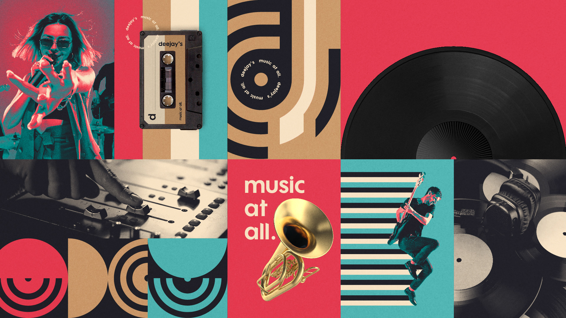
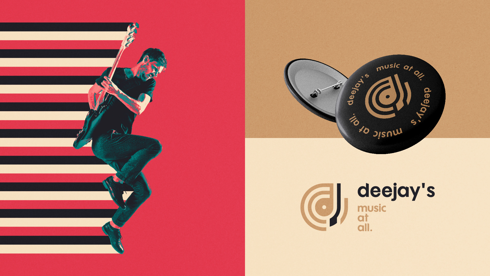
As cores em tons vivos e saturados da paleta, foram escolhidas seguindo as referências oitentistas de embalagens de fitas cassetes e discos de vinil. A ideia era fazer uma releitura, moderna e atual das combinações de cores características daquela época.
[EN]
Colors
The colors in bright and saturated tones of the palette, were chosen following the eighteenth references of cassette tapes and vinyl records. The idea was to make a modern and current rereading of the color combinations characteristic of that time.

[PT-BR]
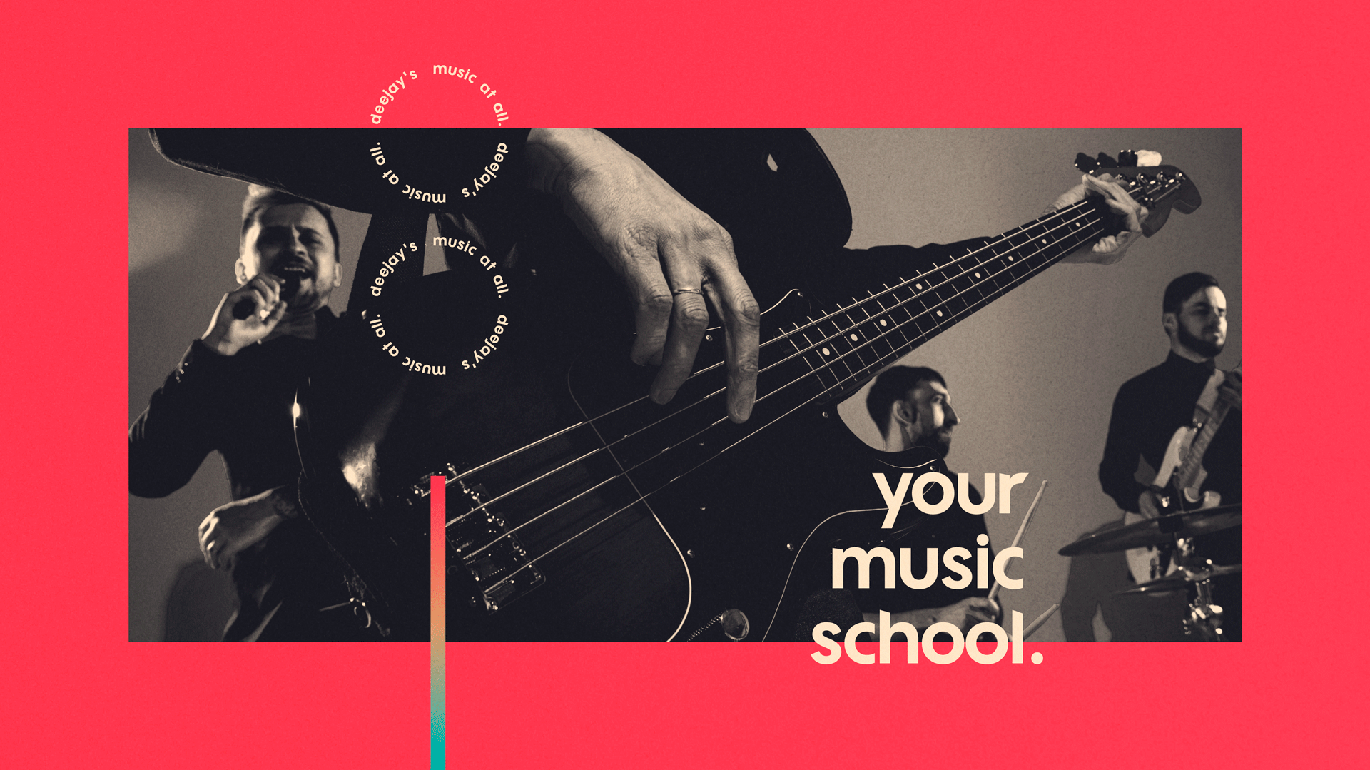
Tipografia
Junto do símbolo, a fonte escolhida para compor o logo, é sem serifa, possui curvas bem definidas, e é utilizada sempre em caixa baixa, para trazer a sensação de proximidade com o público alvo: pessoas de todas as idades que desejam aprender a tocar algum instrumento, produzir ou cantar músicas.
[EN]
Typography
Next to the symbol, the font chosen to compose the logo is without a serif, has well-defined curves, and is always used in lower case, to bring the feeling of closeness to the target audience: people of all ages who want to learn to play any instrument, produce or sing songs.

[PT-BR]
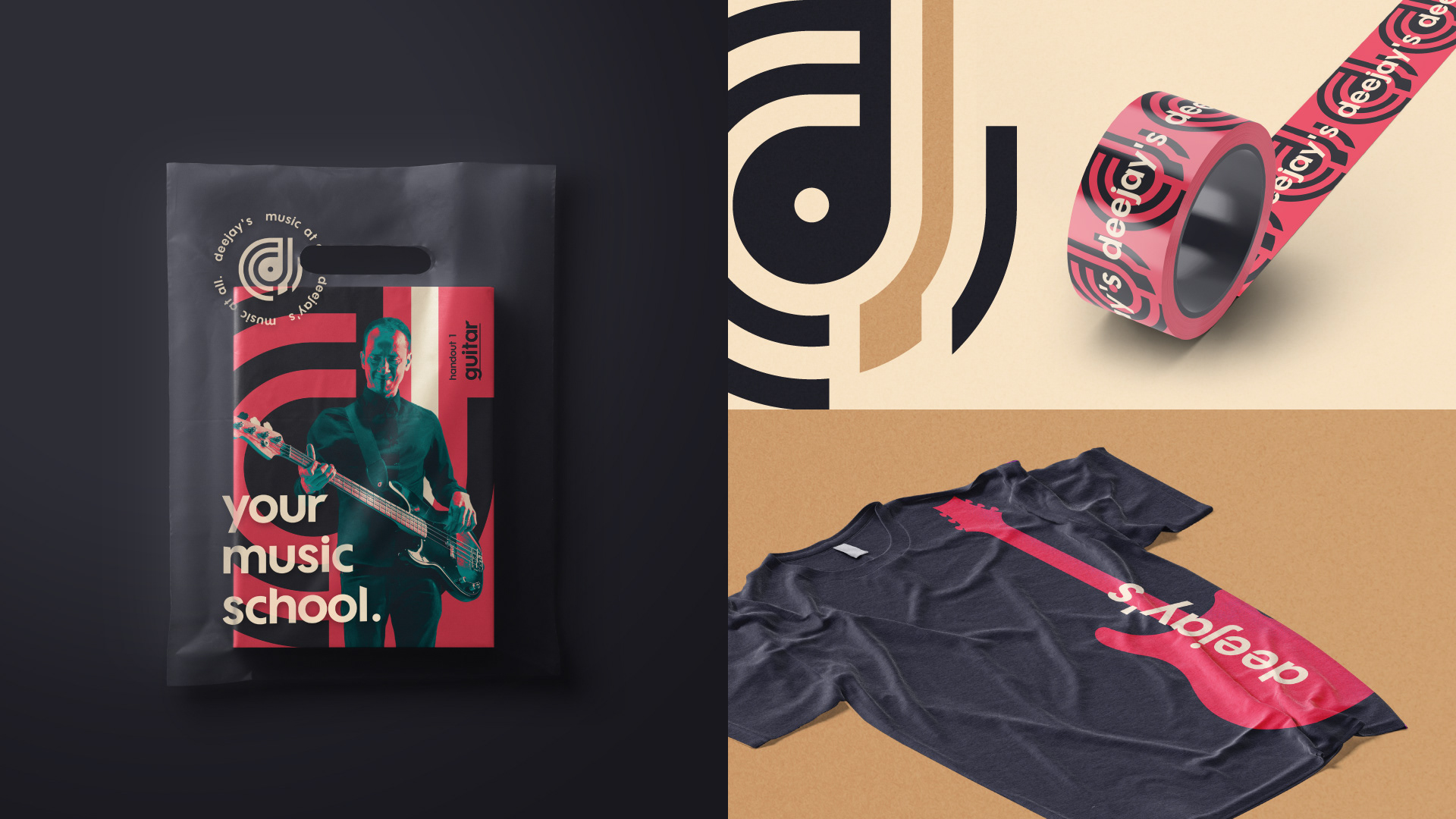
Identidade Visual
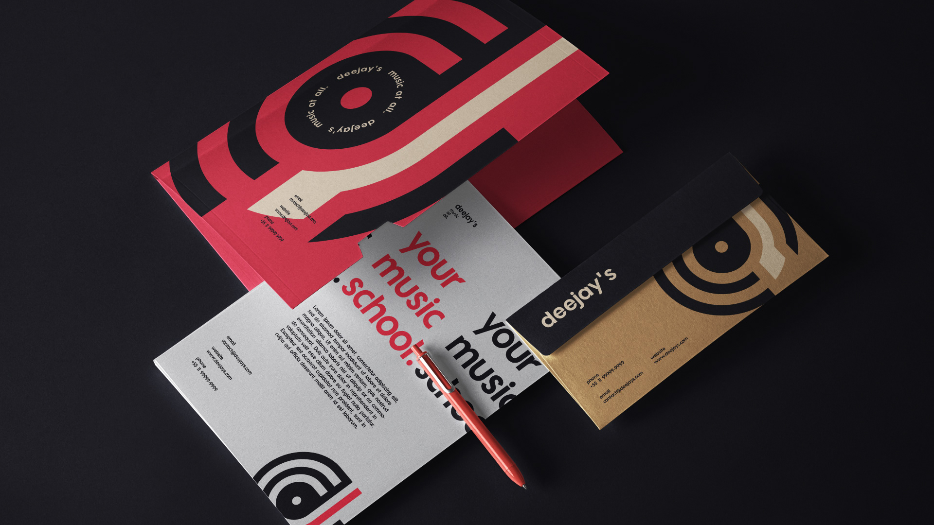
Coerente com a marca e com o posicionamento de mercado que a escola pretende ter adotar, a identidade visual amarra com sucesso a ideia de abranger e atingir pessoas saudosistas que gostam de estilos musicais que já estiveram mais evidentes no passado, e o público jovem, que aspira a produções tecnológicas e modernas.
[EN]
Visual Identity
Consistent with the brand and the market positioning that the school intends to adopt, the visual identity successfully ties the idea of reaching and reaching nostalgic people who like musical styles that have been more evident in the past, and the young audience, who aspires to technological and modern productions.